Saturday, October 31, 2009

Four way combo

Here is my card for th Sweet Stop Sketch challenge AND the Artful Sentiments Copic Challenge AND the TJ challenge to post a card with a TJ technique AND my Sweet N Sassy digital image for Sweet Stop Design Team members.  The whole image is of a little boy pulling the wagon with the pumpkin but since the copic challenge colors were just orange, yellow, and a W (grey) copic, I decided to only focus on the pumpkin.  You can see the sketch challenge and the copic challenge home pages by clicking on the links and banners to the right column.  The TJ challenge was to use any TJ technique.  Well....believe it or not, I had never done Score grid.  At least I don't remember doing it.  It is quite easy!  Always nice to have another way to use my Scor-It (which I love BTW). 

And..........make sure you click on the Sunbeams flashing blinkie to the right side column.  Sweet N Sassy stamps is celebrating their second birthday and they are having a give away.  WOW......can you believe that it has been two years already!  Congratulations, Korin!!


blog signature

Friday, October 30, 2009

A little wine!

Would you like a little bit of cheese with that wine?  Thought I'd color up a few tumbled coasters for my sale since I had them in the Stamp Hole and would like that room for something else.  They were stamped with black StazOn ink and colored with prismacolor pencils.  I have a coaster that I stamped and colored this way several years ago and it has done so well.  So........I have several boxes of the tumbled tiles so I'll do 3 or 4 different images on them.  I like this wine one.  If you were buying them, what other images would you like to see on them?    I needed to watch Zander today while his mommy and daddy celebrated their 5th anniversary.  Hard to think that it has been 5 years already.  They took the underground tour in Portland.  I'll be anxious to hear about that.....we've wanted to take that tour for a while now!  They will be eating dinner in the restaurant where Adam proposed to Leah.  We went to the Portland City Grill for my daughter, Angie's, birthday.  So being there with lots of family was easy.  Adam had talked to the waiters and had a special costume set aside in a back room.  After our dinner and while we were waiting for dessert, several of us went out to go to the bathroom.  Perfect timing for Adam to sneak out and get dressed.  He had borrowed a real helmut and breastplate of a knight (his were leather) as well as a real sword.  He was sooooo nervous. It was also natural for us to have our cameras there since it was Angie's birthday.  My daughter, Leah, didn't see Adam coming back but all the waiters and waitresses were gathered and knew what was going to happen.  He walked up and told her that he wanted to be her knight in shining armor forever and would she marry him.  I'm sure she remembers all the words better than me.  When she said yes, all the waiters and waitresses and half the restaurant cheered.  It was such a fun time. 

So.....now after that long story, please remember to tell me what other images you think would be great for the coasters!


blog signature

Thursday, October 29, 2009

Why oh Why?????

Why oh Why haven't I used these stamps before.  The rose on this memo pad is by Kitchen Sink and I soooooo love using this set.  I tried it once before and it just didn't work well for me.  This time I vowed that I would get this rose stamped and I think that the colors that were picked this time were the real key!  I sooo love their stamps and see more of them in my future! 


blog signature

Cute little memo pads

I'm making some covered memo pads for my upcoming sale.  They are very cute and easy to make.  I'll have four done of each image.  Here is the first image using Branch Out.....my oh my.....SU really made a mistake when then didn't have this set in their current catty!!  It is one of THE best trees!  I angle cut the inside of the front flap so you could store receipts in there.  Sorry that the ribbon covered part of the front, it isn't there permanently!


blog signature

Wednesday, October 28, 2009

H1N1?

Here is one of the last get well cards I'm doing.  It is my tribute to the swine flu this year!  Well, that's my story and I'm sticking to it!  Nothing special technique wise on this one......I just hope that you enjoy!  It was colored with prismacolor pencils and gamsol.


blog signature

Old Sick old Lady out of the box.

Hee hee.......I just had to do another 'out of the box' technique.  They are so fun and so effective.  This card also uses paper piecing.  The chair, pillow, Old lady's dress and sweater are paper pieced.  Talk about little pieces!  They were smaller than they looked at the beginning.  The image is one that I got used from Novell at a SCS shoe box gathering we had in Oregon.  I believe it is an Art Impressions stamp.....that old lady's fingernails look pretty familar.  It is funny though that the block of wood has no company listed only "factory second'.    The only second part about it must be the block of wood and the image on the top of it....they are kind of mushed.  I'll try to do one more get well card design for my sale then on to something different.  Hope you enjoy her!  I think her name is Ethel....what do you think?


blog signature

Tuesday, October 27, 2009

Yup......another out of the box sickie!

Okay.......so these images just lend themselves to being out of the box technique images......You'd do it too, right?!  This is another of the images from the get well set from Our Craft Lounge....they are so cute.  I just love them.  I knew right away that the end of the thermometer needed to have a red jewel, which lead to red jewels on the corners too!  I wanted to do something different with the sentiment and remembered somewhere I had see the little flag type for the sentiment.  This design will be for my upcoming sale.  I've been making 4 of each design that I post.  Have at least two more Get Well card designs to do!  One will just have to be flowers, right?  Enjoy!!


blog signature

One sick out of the box card.

Sounds like the card is sick, doesn't it!  Well.......the card IS for someone who IS sick but nobody I know.  It will be for my upcoming sale.  My daughter, Angie, requested this image.  I've used it before and she really loves it.  Since I colored it with copics this time, I was able to use the blender and make some 'bubbles' in the green liquid.  Glad she's not coming for me!!  The needle is really narrow so I needed to reinforce it so that it wouldn't just break off.  Out come the packing tape!!  This technique of reinforcing small cut out pieces is so slick and easy.  Just place a piece of clear packing tape on the back of the image before you cut it out and it gives the paper just a little more stability when it is really narrow like this needle.  After I punched the layer for the ribbon, I thought I'd use the same punch to 'adorn' the corners.  Pretty neat way to get some extra umph for the corners without shaping them or using brads or eyelets.  I believe that the image is from Lasting Impressions with Panache!


blog signature

Monday, October 26, 2009

Out of the box twice!

When I posted this card to my TJ group I had entitled it "Out of the Box Twice"....then I realized that not only was the image 'out of the box' but so were the tissues!  That's my quirky sense of humor!!  The stamp is from Our Craft Lounge and is in a set that is really cute with running tissue, thermometer, and nose.   The out of the box technique using the Nestability is described in a post a couple of days ago.  It is so easy and looks soooo cool.   I colored the tissue with light blue so it would show up a little better.  I've been diligently trying to use up old patterned paper.  I really love this one....it is by Magenta. 


blog signature

First is last and Second is First!

I know a little double talk and a small reference to a Bible verse!  HA!  Here is the explanation. 

These two cards........yup.....they are for my sale!  The first is the last of my sympathy cards.  The design was inspired by Markie's Mom on SCS.  Thanks, Faith!  The second is the first of a number of Get Well cards for the sale.  The running nose stamp is part of a get well set from Our Craft Lounge.  These designs were drawn by Marianne Walker (my copic instructor extraordaniare).  And you thought the title was something really heavy, huh?!   Enjoy....

I hoping to get a few more get wells done today and will post when done.


blog signature

Sunday, October 25, 2009

My website for my sale!

Yeah!!  My darling son came today and helped me solve some of my website issues.  Thank you sweetheart!  I have my own website to show some of my cards to the people I have invited to my home card sale.  It is a very simple site.  You can see it here:  http://www.createdbyann.com/.  Once we got the pictures into the correct directories and created a site on my home computer for the files (I guess it was different than a directory), then my problems were eliminated.  There is a picture of my mom on the site too.  She is 84 as of yesterday!  I think she is a pretty good looking lady for her age!  Other than playing at church, getting the website done and spending a little time with family......no creating got done today!  Tomorrow, I'll have to really get on the ball again.....only one week left!!

blog signature

Saturday, October 24, 2009

AND one more!

I've been creating like mad today.....at least this one came together quicker!  The beautiful tulip stamp is from Endless Creations.  The decorated paper is from Hot Off the Press and has shiney gold stripes on it.  The gold brads scanned dark and they aren't really so that makes it look kind of strange.  The tulip was colored with copics.  The inside has a sympathy sentiment.   The tulips were cut out and mounted up with foam tape.  Sorry for all the posts today.  I hope that you have enjoyed them!  I do have one more that I created today but will post it tomorrow.


blog signature

And yet more!

You know sometimes you go to the Stamp Hole to create and cards just fall together like they were meant to be.  Then on the same day, you go down and it is like pulling teeth to pull that card together.  This card didn't start out anything like it ended......that seems to be the story of my life lately!  I originally had a piece of small uneven purple check.  Chucked that pretty quick.  I was going to recolor the leaves after I had bleached them and the cardstock wouldn't bleach out any more than the color you see.  So I shelved the recoloring idea and the cardstock was fighting me.  Sheesh!  So.....I hope that the end result is okay.  It is another sympathy card and the inside says "With Deepest Sympathy".  The leaf stamp is from a set of three from Stampin Up but I have no idea what the name of the set is.......I got rid of the plastic containers long ago before I cared about the set names.


blog signature

AND more!

This card turned out TOTALLY different that I first imangined it.  Which happens often!!  I was originally wanting the dark layer on top of the image so the shell was recessed but the cut edge to the inside of the nestie just didn't look right.  I thought that maybe impressing the nestie shape on the shell would give the umph that I wanted under the dark layer but no go......so I flipped the layers and voila!  Success!  The shell is colored with copics and is an image from a Stampin Up set that I purchased from Kimm!  Thanks, Kimm.....I LOVE my set.  If you look real close you can see that there is a little Gelly Roll sparkle on the shell.  It was terribly hard for me to just leave this card as it was.......I really wanted to jazz it up with more layers and embellishments but know that some people like more simple cards so I tried to create some! Funny how the outside light changed the color of the card too.....is more golden looking that the picture.  Thanks for looking! 


blog signature

More!

I have a number of different cards I need to make today.  Here is one that I did during the week and didn't have time to post.  This was one of the DTP cards that Michelle Zindorf featured on her blog a couple of weeks ago.  I didn't have the colors she suggested.....only a few.......but I like the result.  My mountains are a little dark but I still like the overall effect.  This was a FUN card to make....I made four of them and each look different, like a little piece of special art.  Thank you, Michelle, for your great tutorial on this one.  I think she makes her cards much bigger than I do....probably 5 x 7.  Mine are only the 1/4 sheet size so my palette is a little smaller.  I hope you enjoy!!  I didn't have a sentiment small enough so I scanned in the River City Rubber Works "In Sympathy" and reduced it in size.    The words to the side were from an unmounted stamp that I got AGES ago before I was really worried about keeping track of who made what.  Probably Stamp Camp or Rubber Stamp Ave.  The trees, leaves are SU  The flowers at the base were from Inkadinkado.  I hope you enjoy my mini canvas!


blog signature

Three in one!

Well......it has been a hard week but I made it!!  Here are my design team challenges rolled into one!  The Sweet Stop Sketch Challenge can be seen by clicking on the Sweet Stop badge to the right!  It was a fun sketch this week......if you give it a try you can upload your creation on the Sweet Stop blog! 

The copic challenge at Artful Sentiments by Kimm are such beautiful fall colors this week...at least the end of fall!  Here they are:

You can upload your creation on Kimm's blog as well for the copic challenge....let's see what you can do with your colors!  Click on the "see Kimm's blog here" link at the top right to upload and see what the other designers submitted.  The inside of this card says "We share in your sorrow."


Then the third part of the 'three in one' is that I needed more Sympathy cards for my upcoming card sale.  This card also incorporated the torn frames and 'out of the box' techniques from the Technique Junkie newsletter.  Whew!  I love how you can do out of the box techniques with the nestibilities.  It is sooo easy.  place your nestie over your image when you will be cutting.  Use a pencil and draw on your image along the inside edge of the die.  Take die away and use scissors to cut away the edge of the paper and around the part of your image that will be hanging 'out of the box'.  Put your die back over the image but slip the cut out part over the top and away from the cutting edge.  So simple!  Hope you enjoy!


blog signature

Friday, October 23, 2009

Awful Day.....

Yesterday was not a very productive day for me.  I thought I'd sit down and quickly print out the sale flyers for my upcoming card sale.  Alas.......out of ink and the cartridge I thought I had .....wasn't.  So, I moved on to get my web page (http://www.createdbyann.com/) up and running for the sale.  Dreamweaver would NOT cooperate with me yesterday.  I spent HOURS working on it and even though I have everything in the right spots, it will NOT put my pic, header, background and the pic of my mom on the home page.  I think I may even just start over from the beginning to see if I can eliminate something I did wrong.  Maybe a web design class should be in my future.  I got the gallery page, snowglobe page and directions page all done and linked to the home page and the links even worked so at least I did something right.  Then off to praise team practice and dropped the cartridges off at Walgreens to be refilled.  Forgot to pick them up on the way home and had to make another trip to get them.  At least I got the flyers printed off last night so the whole day wasn't a waste.  So.......today.......I gotta get some stamping done....plus organ/piano practice and a smidge of housework. 

Bottom line........got any web page production hints for me?  I'll take them all!!

Tuesday, October 20, 2009

More and More....but now onto the girls.

Here is the card I made for Leah's dragonfly girl's bib.  I used the Double Bugging technique from the Technique Junkie newsletter.  Although I didn't color the second bug run through!  The scan did funny things since I have the wings of the dragonfly mounted up high.  It made the background look dark but it really isn't.  I used SU's craft white for the first layer of the double bugging.  I outlined some of the paisleys with my copics to make them stand out a little more.  Special thanks to my SU demo, Laura, for the color letting me borrow her SU punch for the sentiment.  It will need to be on my next order!!  I didn't have the color I really wanted for the ribbon so I colored it with my copics.   As with the other pictures, the fabric of the bib is laying behind the card on the scan.  Hope you enjoy!!

Monday, October 19, 2009

More bib cards!


This bib card is for a girl.....finally......I was getting tired of doing boy ones!  It took quite a while to finally have a design that I was happy with.  It used a Technique Junkie technique called Scrappy Spots but I tweaked it a little bit.  Some of the white spots (the little ones) are embossed with clear so the brayering wouldn't get them.  Since I wanted the spots white, I didn't color them before the brayering.  Stamps are from $ bin at Michaels (for the flowers and such).  The words are from Hambo.  I think this one really turned out very much like the bib, don't you? 

Below is the last boy bib I needed to work on.  Don't worry about the wrinkles on the fabric......it hasn't been sewn yet!  The image is from Dustin Pike and colored with copics. The waves were made with a Souflee pen.   I also got to use my brand new Labels 5 dies!  Enjoy!

Sunday, October 18, 2009

More Bibs!

On an earlier post I told about my daughter making bibs for my upcoming sale.  I am making cards to match them and have two more to show you.  The image on the space one is from Dustin Pike and is colored with copic markers.  I am going to put some Diamond Glaze on the top of the space ship but didn't want to wait for it to dry to scan the card....besides it doesn't scan anyways, right?!  The image on the John Deere tractor one is a piece of clipart that I had to alter to thin down the lines.  It was also colored with copics.  Hope you enjoy!!


Saturday, October 17, 2009

It's Saturday and time Two challenges

Yup.....Saturday is the day for both the Artful Sentiments Copic Challenge AND the Sweet Stop Sketch Challenge for Sweet N Sassy Stamps.

This week the copic challenge uses the colors shown to the side.  So,
what do those colors look like to you?  Well, I saw colors that I could use for my Artistic Outpost clown!  I have been wanting to use this clown from their set for a long time.  I've also wanted to do the Technique Junkie technique called Scappy Spots that was submitted by Nancy Judd.  This was just the perfect color combo!

******************************
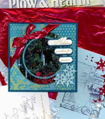
Now on to the Sweet Stop Sketch Challenge.  The sketch challenge this month is listed on the Sweet Stop blog.....click on the logo to the right to see it!!  This was a sketch with a spin.....you had to use recycled items.  I have been thinking about this sketch for a long time and NOTHING was coming to my mind.  I had a few small recycled items to use but they just weren't speaking to me.  For the card below, this is what I recycled....

1.  A Plow & Hearth sales magazine picture of a wreath and candle in a window
2.  A Mylar red balloon
3.  The blue badly stamped piece of cardstock
4.  Words from the inside of an old Christmas card.
5.  All the Cardstock was from my scrap bin


So....what is your opinion....passable? !!

Friday, October 16, 2009

Here's the deal.....

Okay.......my card sale is coming up and my daughter, Leah, usually adds a few things to the 'for sale' stuff.  She has made Scrubbies out of nylon net for at least 6 years and she is getting quite a following.....people LOVE her scrubbies.  Hmmmm..........here is a thought.......let me know if you would like a scrubbie.  If you think it is a good idea, I'll offer one as a piece of blog candy for fun!!  Now....back to the story.  This year she is going to make baby bibs....we have a number of new babies coming at church.  So, I'm going to make cards to match the bibs and they will be sold 2 bibs and 1 card together as a gift.  Like the idea?  I hope that lots of people do.  So, here is the first card for the dino bib. The fabric is shown first and the card that I made to match it is below.   I'll be making about 6 different cards to match her fabrics.  The darling image on this card is by Dustin Pike and is a digital image.  It is colored with copic markers.

Made the list

Sometimes do you create and wonder......am I really doing well?  Thanks, Marianne for the coloring comment, it REALLY made my day.  To get a comment so short like "Nice Coloring" may not seem like much but when it comes from the Coloring Diva herself (Marianne Walker), then I'll take IT!!  Again.....THANKS MARIANNE!!  ;-)

Thursday, October 15, 2009

Faux Paneling


Here are another two cards from the design team work for the October Newsletter of Technique Junkies.  This is a technique called faux paneling.  I had fun with this one.  I haven't used that chair stamp from Art Impressions for years.  My copic markers made it sooooo easy to color in.  Then the cat in the window stamp is from DOTS.....now THAT is an old stamp!  It was fun to really get into the 3-D-ness of the card.  The bottom pieces are from a cuttlebug die.  Hope you enjoy! 

Tonight we had our Rhododendron Society meeting.  We were to dress up to 'celebrate' the Halloween holiday.  Since we only ahve one meeting a month, tonight was the night to have some fun.  Ray is a die-hard Oregon State Beavers fan.  The Beavers colors are Orange and Black.  There is another man named Mike in our group is also is a Beavers Fan but he is four times more die-hard than Ray.  He has season tickets to their games....and has had them for years!  Ray went with him to several of the games this year.  So....back to my story.......Ray decides that he is going as a Nightmare......he is going to wear an Oregon Ducks shirt.  he Ducks are Green and Yellow.  I decided to dig around the kid's dress up box and came up with a cape and crown to be a queen.  Nice and simple.  So....we walk into our meeting and there is Mike and he is dressed like a duck too.........everyone else saw it too....quite funny!  I know, I know....you really had to be there!

Faux Marbeling from TJ


When you do cards for a TJ newsletter as a design team member, they are completed several months before the newsletter arrives at your doorstep.  So, I often forget to post the ones I have created.  Here are the cards I created for the faux marbeling technique.  (Remember.....if you aren't a Junkie....you NEED this newsletter to have ALL the directions for the techniques!)  Instead of exactly following the directions for the veining part, I held my pen at the very end opposite the tip and lightly drug it across the paper.  That way the pen kind of went where it wanted and created more realistic veins.  The butterfly shadow was made with copics to make it look like it was more 3-D when it was flat!  The flowers on the second card are made following the instructions on Splitcoaststampers.  They are quite easy.  I have seen them done with more ornate border punches as well.  Hope you enjoy. 

Tomorrow I'll post the cards I did for the faux paneling technique.  I had two other cards for October's submissions but it was for a technique that was postponed until December!  Can't wait to show those to you.  I'll have examples of most everything from my blog at my upcoming card sale in November!

This week I should have gotten more done.....my grandson, Zander, was sick.  All the grandkids have been sick.  Breauna has had the flu and was home Mon, Tues & Wed with fever....haven't heard about today yet.  Poor kids.  Some of the moms have been sick too.  I say.....Keep them away from me!!  I don't want the flu.  I don't have time!!  I did get some filming done for new techniques!!  No sharing though!

My 36th anniversary was on the 13th.  We went out to dinner at a new place with one of our Restaurants.com coupons.  THIS restaurant was quite wonderful.....unlike the Smokey Mountain BBQ place!  It was a Thai restaurant and everything was absolutely deee--licious!  We took Jim, Ahtia and Little Jim with us as their anniversary was on the 14th!

Sunday, October 11, 2009

Burnished Lucy


This card's background is a technique from the most recent Technique Junkie newsletter called Burnished Backgrounds.  I didn't start out with white cardstock, however, so I burnished with white craft ink (which turned kind of pink).  Lucy is from Stampsmith.  She is colored with copic markers.  The background stamp is from Stampin Up and the stamp hole is too far away to run down and get the maker on the "I love you" stamp.   After I had Lucy colored in, there was just something missing and I couldn't pin it down until I remembered that her eyes needed a white dot.  Voila!  That was it......dark holes of eyes made into real eyes with the dot of a Signo pen.   Enjoy!

She was also made for a challenge over at Gingersnap Creations!  They have a challenge to make a card with Stars.....my star is Lucy!  Here is the link to their challenge.....HERE.

Saturday, October 10, 2009

It's Sugar Baby and Artful Sentiment copic Challenge time!


AH!  I forgot to get this post on automatic yesterday!!  Sorry I'm late!!  Here is my card for this week's challenges.   This week I combined the challenges.  The colors for the copic challenge seen to the left inspired leaves.....right?!  I'm STILL wishing that I was in New England so see the beautiful fall colors.   Personal Interlude:   Last night we went to a new place to eat.....I had a coupon for $25 (you had to spend $35).  It was a BBQ place.  I'v e been hankering to have some Yankee Smokehouse BBQ since last year in New Hampshire so when I saw the Smoky Mountain BBQ I thought.......hmmmmm......maybe it will be as good as Yankee....     Wow......Nothing could be further from the truth.  The 'restaurant' ended up being an order window inside a bar.  At least in Oregon you can't smoke inside any building anymore.....thank goodness....or I would have had to leave.  The meatloaf wasn't too bad.....but almost every bit had something unchewable.  The brisket sandwich was FULL of fat.....ewwww.  The 1/2 rack of pork ribs wasn't too bad but lacked any real BBQ taste and the middle of the rack was cold.  The black beans were fair to midland but the potatoe wedges and sweet potatoe fries were fine.  I had two gift certificates to go there but I don't think we'll use the second one. 

Okay.....back to stamping.    After I decided I wanted leaves, I grabbed Sweet N Sassy's Autumn set which is drawn by Chris Dickinson.  I did use my blender to lighten the colors a little so they would look a little more leafish!  This sketch layout is from the Sweet N Sassy Sweet Spot blog....you can click on it to the left on my sidebar.  The long piece below the image is a Technique Junkie technique called Painted Mesh.  I used gesso instead of acrylic and toned it down with sponging.  The card ended up being a little dark but I guess it made the image stand out that way, right!  Around the image I also used TJ's Rubber Thwamping.....a technique that I submitted.  I think the technique has been around a while though.  I just love the texture that it can give....much different than sponging AND it is easy to clean off to reuse.  The maple leaf brad was a embellishment that I frankly forgot I had!  I have a slew of brads in different shapes that I got at the last Hot off the Press warehouse sale (locally) and I had them stored in those divided containers......I just never remember to look in there!!  Hope you enjoy this week's ramblings!